Visual identity for Bombarda Maior
Bombarda Maior is a social innovation project launching in 2025, aimed at fostering intergenerational inclusion in Porto’s Bombarda district. By actively involving senior residents in the neighborhood’s creative and commercial life—through skill-sharing, support for local businesses, and participation in cultural activities—the project addresses social isolation and generational disconnect.
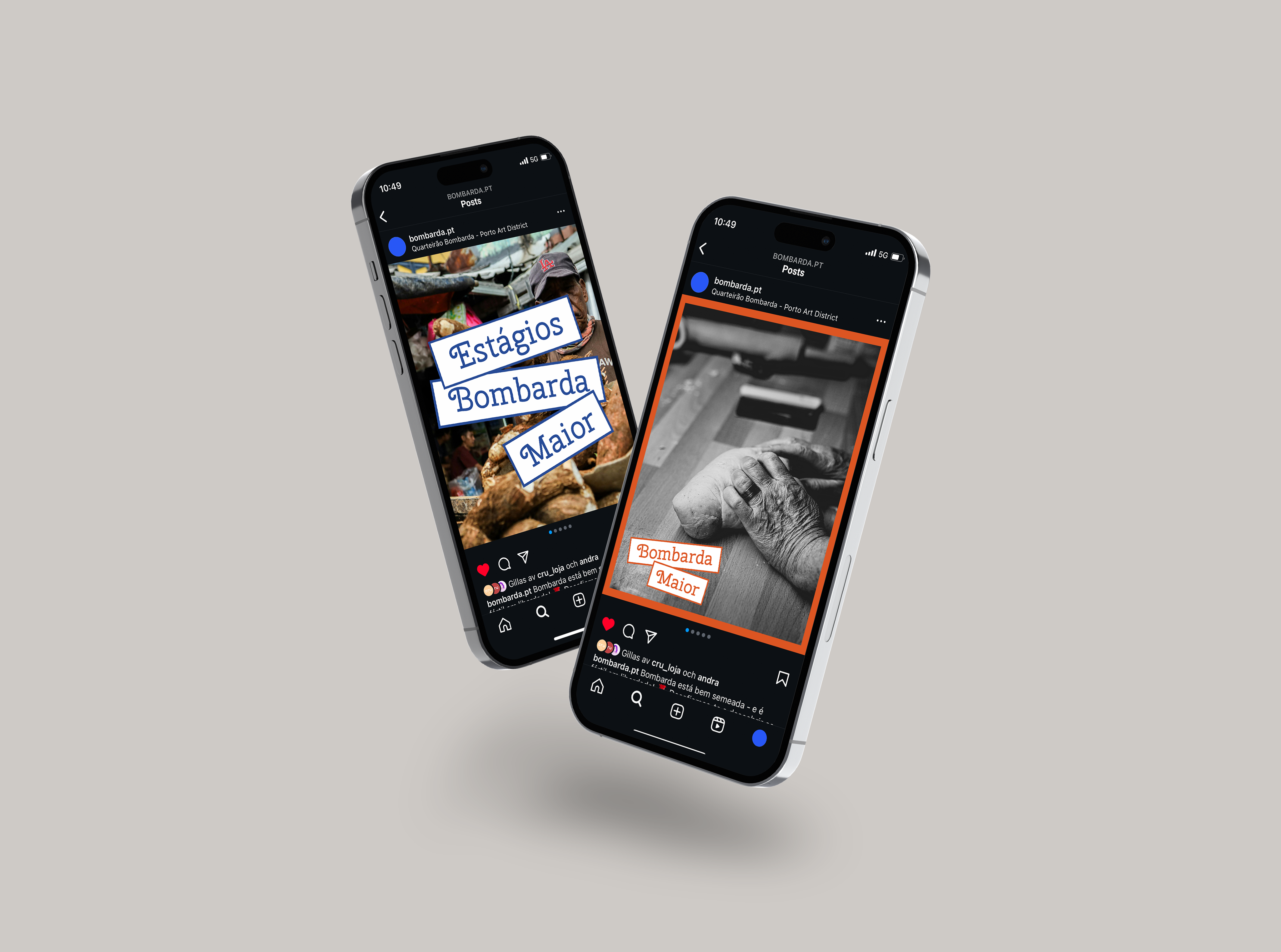
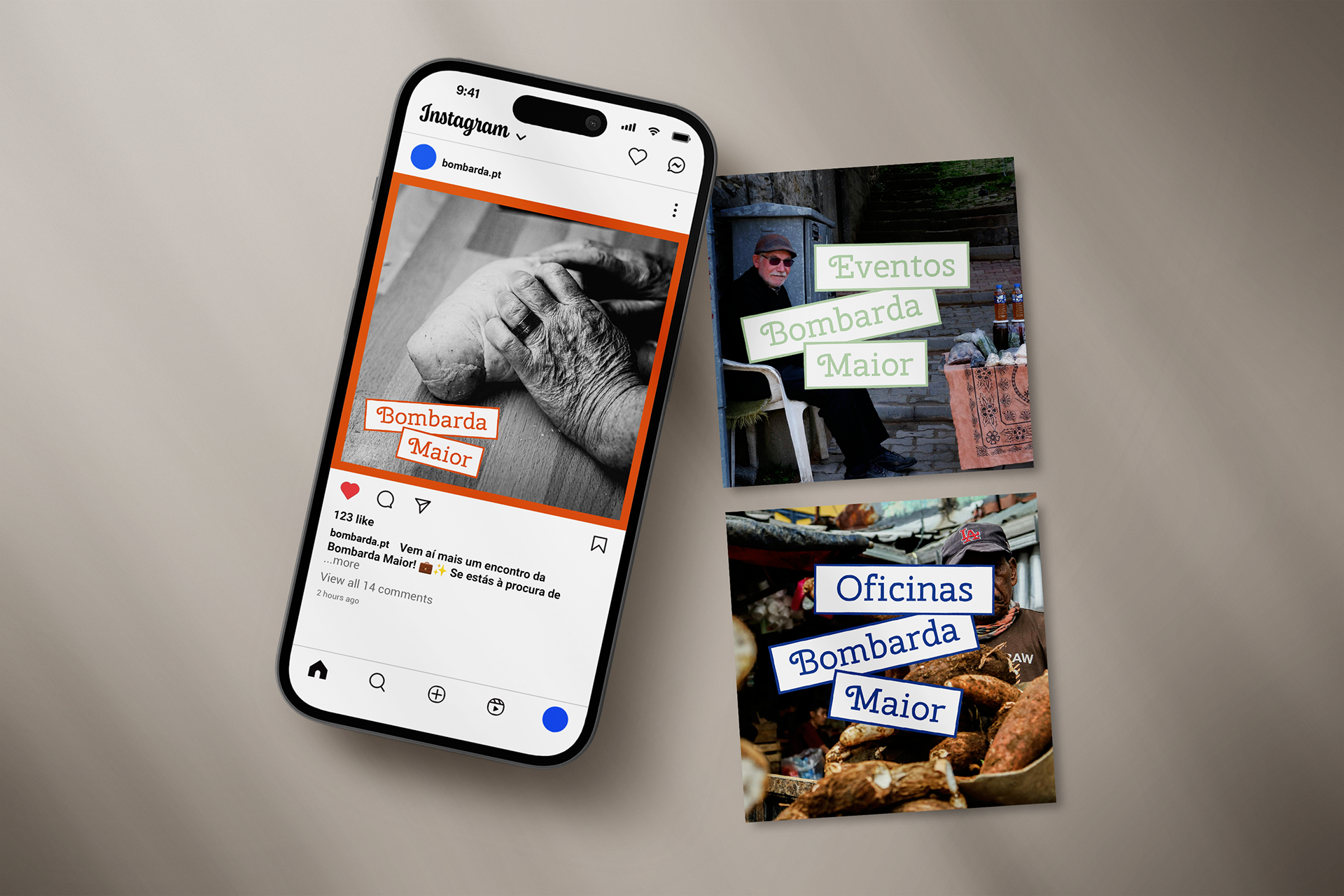
Brief: Design a visual identity for Bombarda Maior that communicates the project’s core values: local rootedness, nostalgia, and social inclusion. In addition to the logo, the identity should include adaptable applications for Instagram, such as frames, post templates, and visual elements that can be reused for ongoing communication.
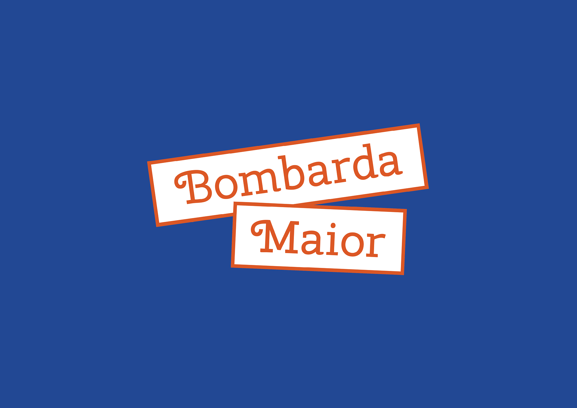
Solution: The logo for Bombarda Maior is designed to visually reflect the project's core values – local rootedness, nostalgia, and social inclusion. It features two clearly framed words, "Bombarda" and "Maior," placed within slanted rectangular fields reminiscent of classic street signs. This design directly references the geographic area of Quarteirão das Artes de Bombarda, where the project is based, thereby reinforcing the local identity.


Color
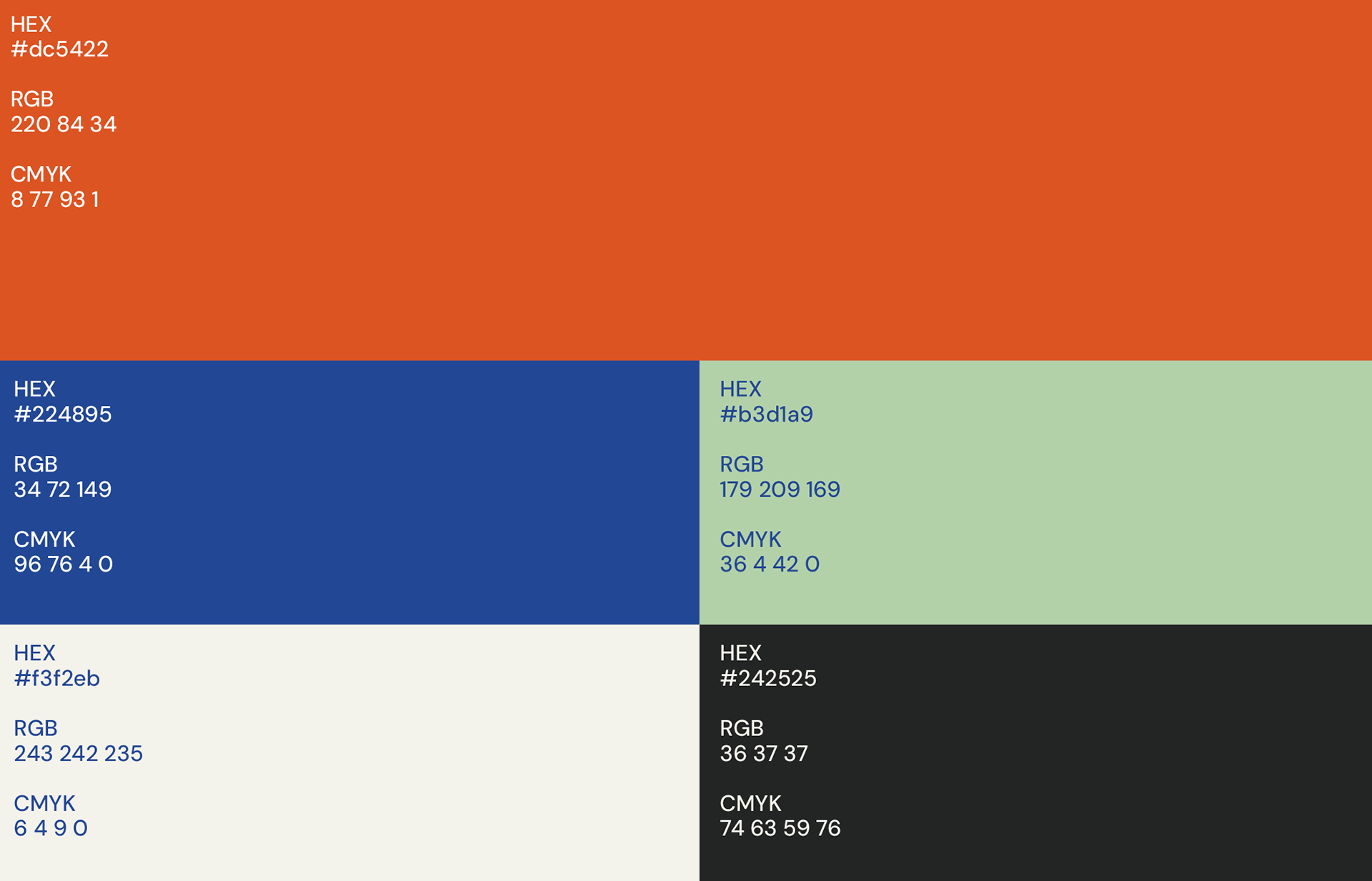
The color scheme of Bombarda Maior was carefully selected to align with the project's core values.
Shades of blue, orange, and soft green were chosen to convey trust, warmth, familiarity, and renewal. This palette is both intergenerational and emotionally resonant, creating an inviting atmosphere that appeals to a wide audience.
.
Type
Cherry Swirl was selected for the logo because of its playful yet sophisticated design, which embodies the spirit of Bombarda Maior.
The font's fluid, rounded curves evoke a sense of warmth and approachability, while its bold structure ensures legibility and impact.
